brand identity
brand atmosphere
package design
grooming products for horses (and their rider)
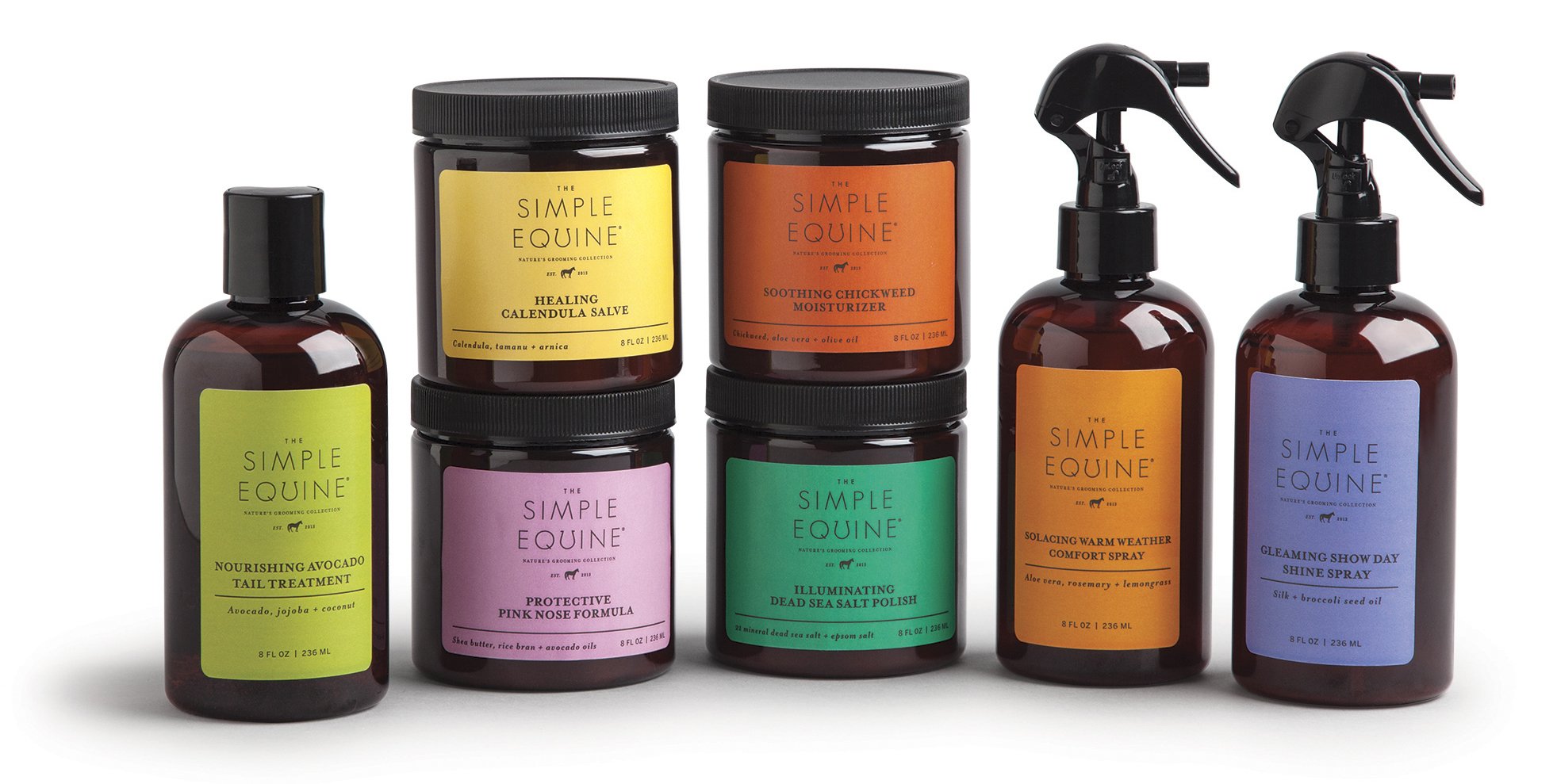
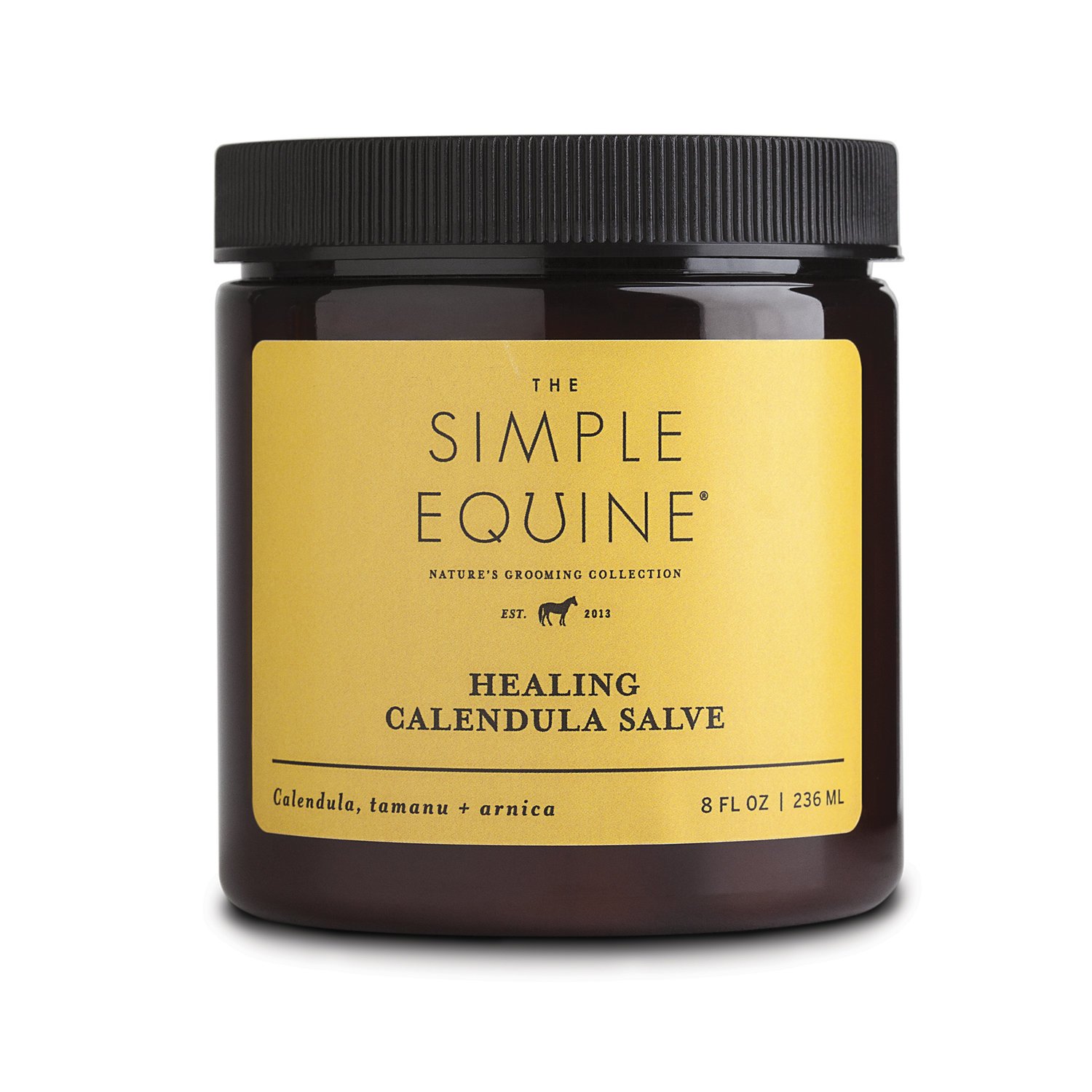
For a brand that boasts its use of simple ingredients, a logo that reflects this ethos with sophistication was essential. Customizing the typography to subtly incorporate a horseshoe not only communicates the brand's simplicity but also adds a touch of intelligence to its identity.
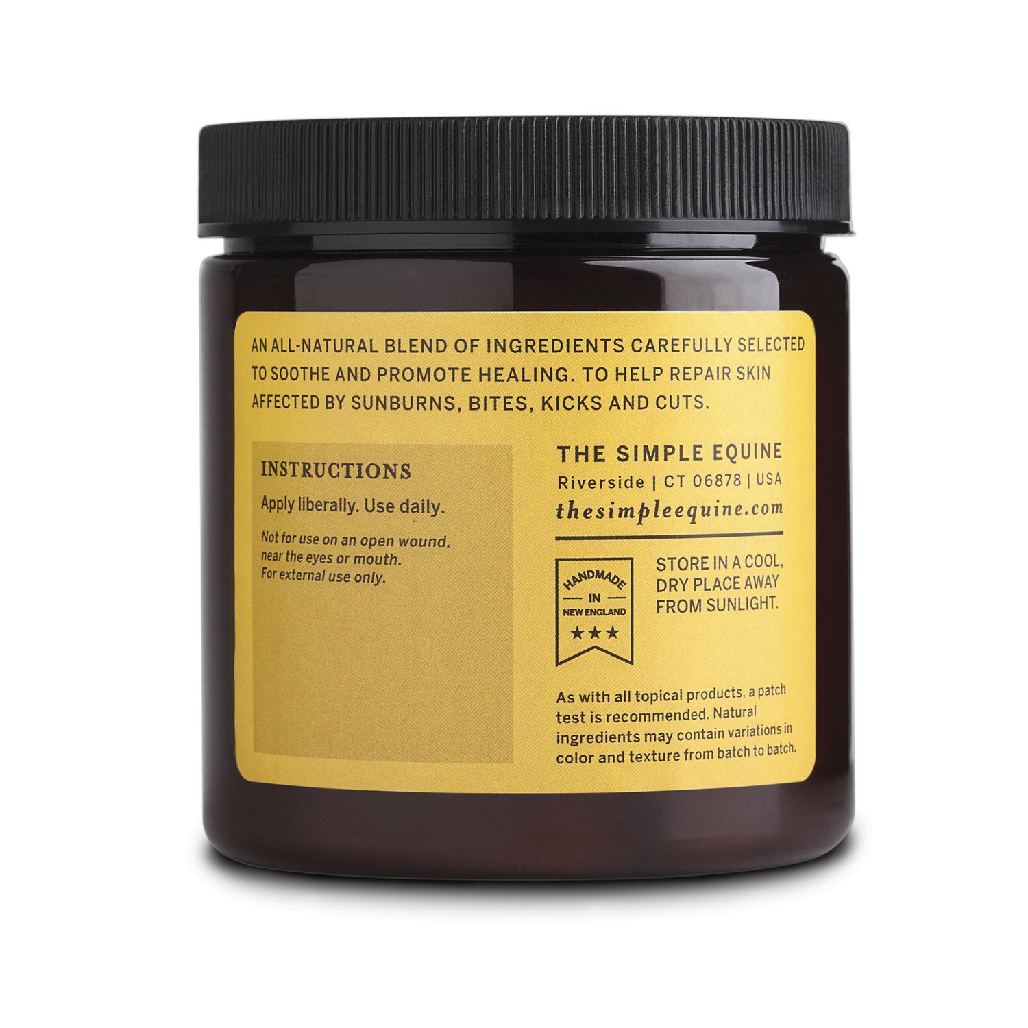
To elevate the brand further, apothecary jars and packaging were carefully selected, imparting a sense of refinement and sophistication. Paired with friendly, fun, and approachable colored labels, the packaging stands out on shelves, inviting customers with its vibrant presence. Ultimately, this brand aims to help both horse and rider feel their best, and its logo and packaging embody this mission with style and charm.


