identity design
brand atmosphere
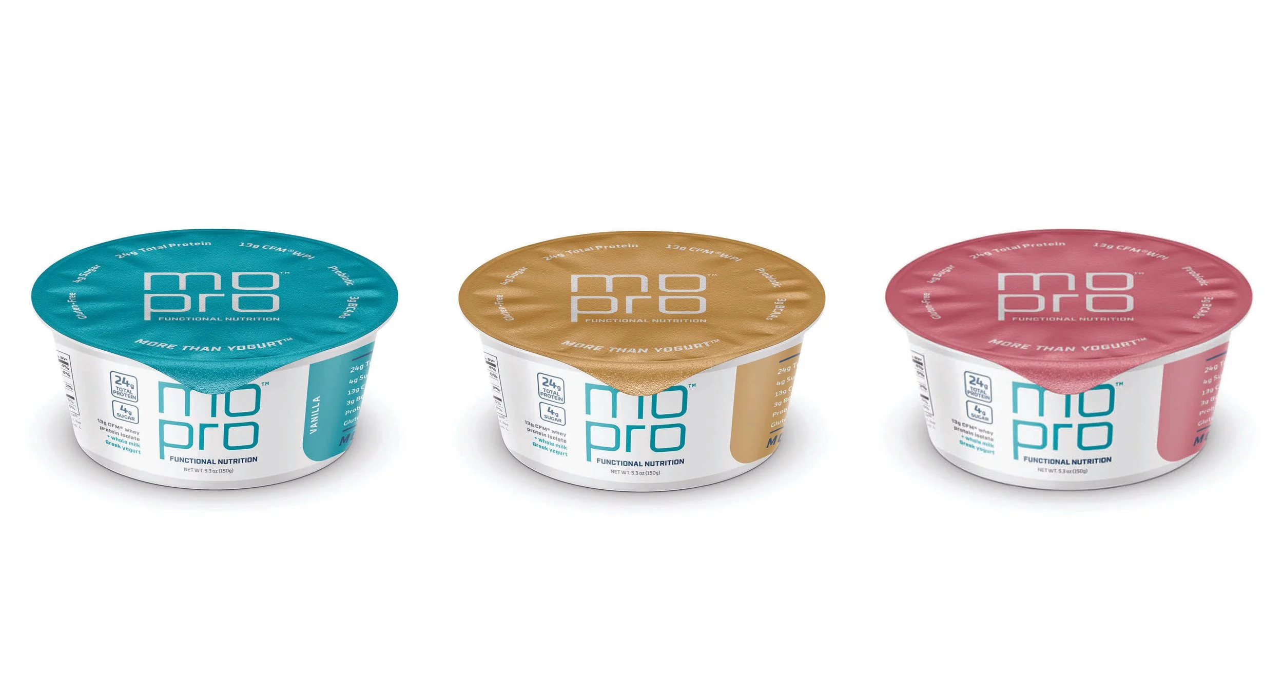
package design
the 1st greek yogurt infused with CFM® whey protein isolate
Introducing the first Greek yogurt infused with CFM® whey protein isolate called for a cutting-edge, forward-thinking identity. The brand was designed with a modernistic, future-forward approach. The typography was meticulously handcrafted from square forms, lending it a sleek and futuristic flair that perfectly matched the brand's innovative nature. The straight edges of the typography complemented the curves and subtly hinted at the pull tab on the yogurt containers, creating a cohesive and intuitive design. Blue was selected as the original brand color for its refreshing and clinical feel, adding to the brand's appeal “more than yogurt.”
The "mopro O," served as an ownable shape, ideal for callout information and quotes, further solidifying mopro's distinctive identity in the market.


